Updates.fm
Mar 19
-
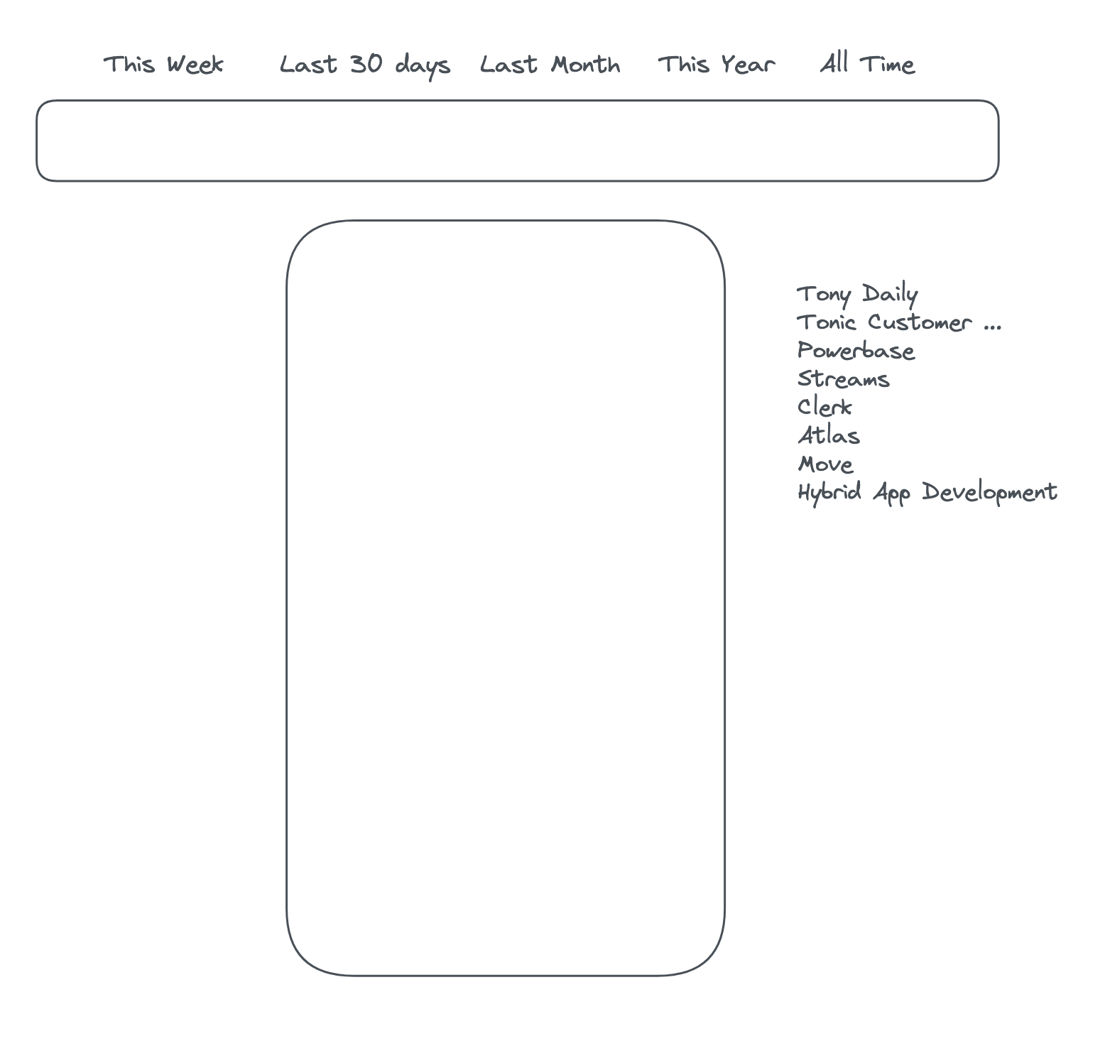
Thinking: I'm still not feeling the new top navigation from a browsability perspective - because it's horizontal it doesn't show the full names of the streams, and if it did they'd stretch out too far. I'm wondering if, now that we are fading out the content on the sides anyway, we could have a vertical streams menu to the right of the content, and potentially stretch out the time periods above the timeline at the top and make them both full width. Something like this:
-
-
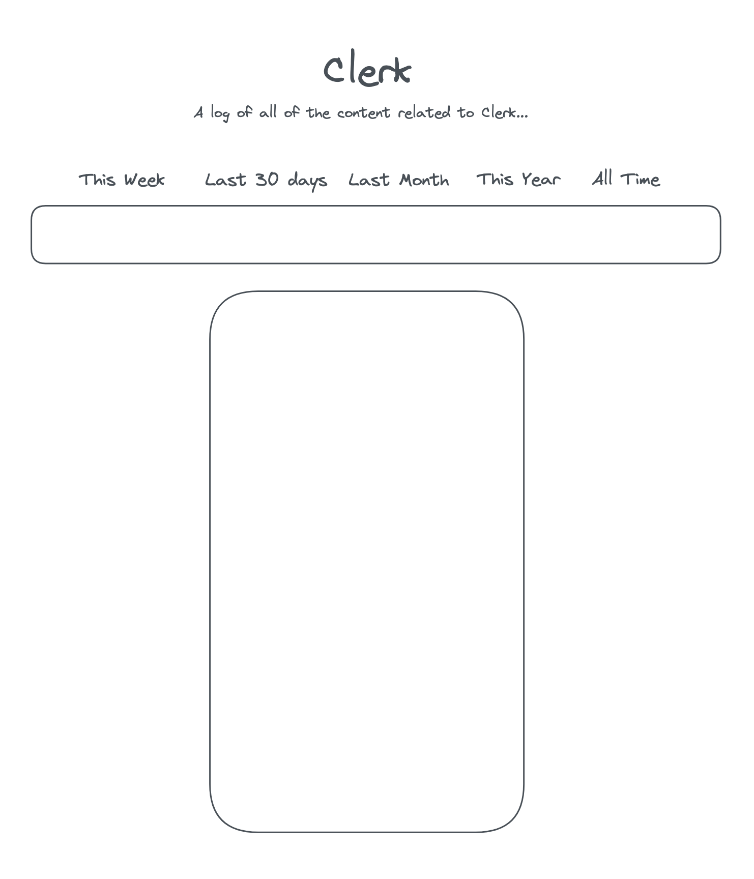
Draft up design for "Solo view" screen - a view that shows posts from a single stream with no ability to switch to other streams
-
-
Draft up the next release: March 24 release