-
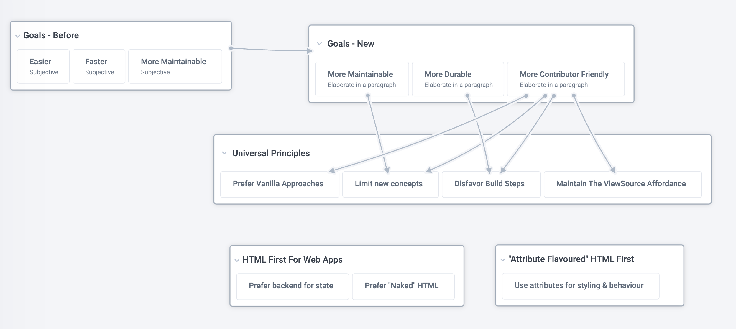
Have spent about an hour a day for the last few days jotting down more ideas for where I should take v2, including writing, then removing, new sections. I was second guessing myself a bit, but as of today's session I'm quite happy with this new direction. It retains the idea of being designed for contributors, without focussing too much on "let more people become programmers", which I don't think resonated in v1.
-
It also removes the subjective bits which drew a lot of objections - "easier, faster, more maintainable", and separates out the attribute-based stuff, which was also quite radical and likely unnecessarily alienated people.
-
At the same time I think it remains true to the original ideas I was attempting to capture, which was what I had been grappling with in the last few days. So overall I'm happy.
-
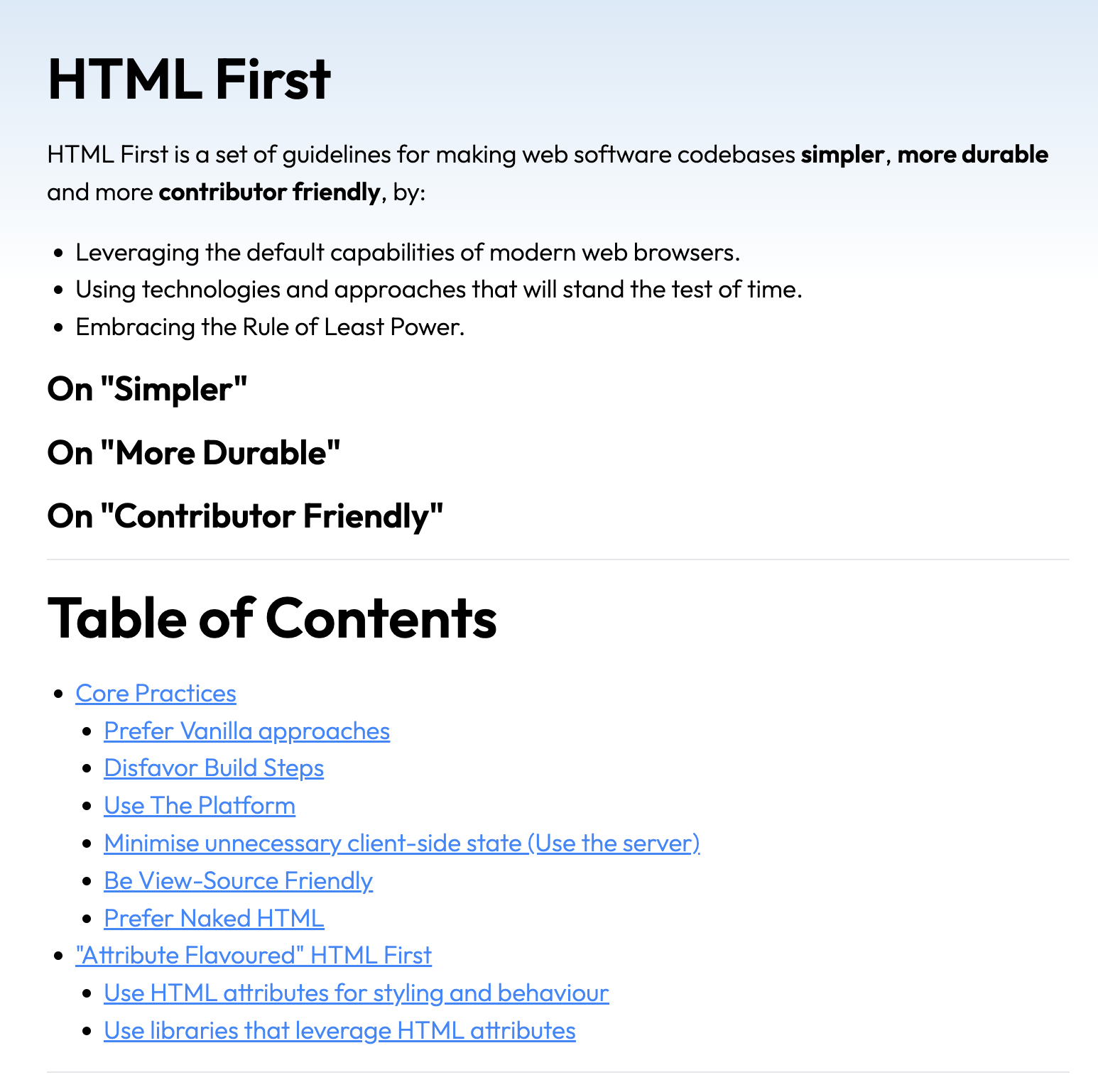
I still need to write descriptions for 5 sections - will try to do that during the next few days and/or on the plane home on Tuesday. Screenshots below of the before and after.
-
Before
-
-
After
-
-
Thinking: If I want to take the learnings of the original launch and improve it, what are the takeaways & things to focus on?
-
Better examples
-
Less normative - "Principles for X" vs "This is one style"
-
Less focus on subjectives and broad terms - "easier", "faster"
-
Break out attribute-based stuff
-
-
Map out thinking on new version
-


