tony
Week 13
26
1
Week 10
26
4
Week 09
26
4
Week 08
26
1
Week 07
26
1
Week 06
26
1
Week 04
26
4
Week 01
25
4
Week 52
25
4
Week 51
25
12
Week 50
25
4
Week 49
25
16
Week 48
25
53
Week 45
25
9
Week 44
25
2
Week 37
25
1
Week 19
25
1
Week 51
24
1
Week 41
24
2
Week 25
24
1
Week 20
24
2
Week 13
24
1
Week 11
24
1
Week 09
24
1
Week 08
24
1
Week 07
24
2
Week 06
24
1
Week 03
24
3
Week 02
24
4
Week 01
24
7
Week 52
23
7
Week 51
23
5
Week 50
23
7
Week 49
23
3
Week 48
23
4
Week 47
23
7
Week 46
23
9
Week 45
23
10
Week 44
23
7
Week 43
23
5
Week 42
23
7
Week 41
23
8
Week 40
23
10
Week 39
23
10
Week 38
23
22
Week 37
23
5
Week 36
23
1
Week 34
23
2
Week 32
23
1
Week 28
23
1
Week 25
23
1
Week 24
23
1
Week 21
23
2
Week 20
23
1
Week 19
23
3
Week 18
23
6
Week 17
23
1
Week 16
23
2
Week 15
23
5
Week 14
23
5
Week 13
23
1
Week 12
23
7
Week 11
23
10
Week 10
23
2
Week 09
23
1
Week 08
23
4
Week 07
23
2
Week 05
23
1
Week 04
23
4
Week 03
23
1
Week 02
23
2
Week 01
23
9
Week 52
22
5
Week 51
22
3
Week 50
22
19
Week 49
22
3
Week
52
tonyennis.com
Dec 30
-
Improvents on mobile projects page
-
Prevent images from spilling off the page
-
Remove the left date column
-
Still to do: Improve display of long completed tasks, improve display of projects table
-
tonyennis.com
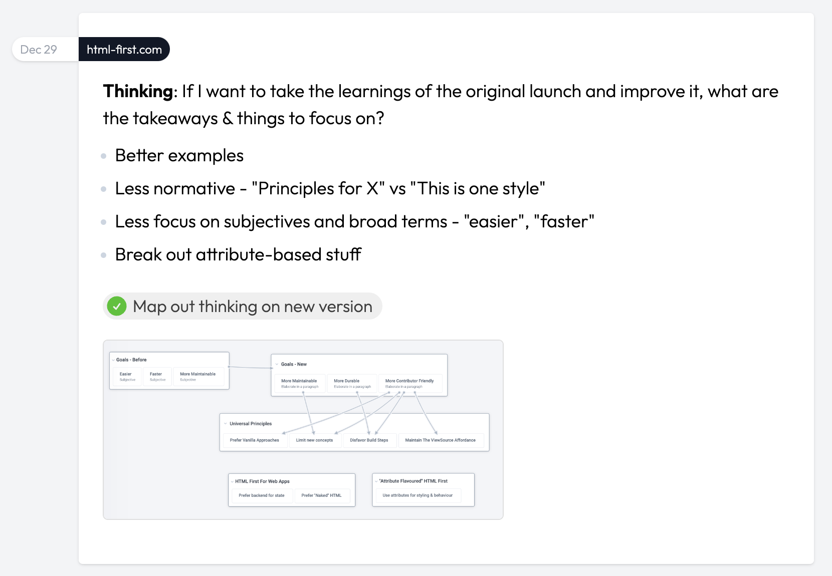
Dec 29
-
Thinking: I'm not liking the styling of the dates. The project isn't obvious enough and the left column feels like it needs too much space. It's also not super useful to see the month at the top because there tends to be quite a few posts for each month.
-
Design/code new style for date/project pills
-
New Design 👇
-
-
Thinking: The font still irks me. Wonder how the one AJ likes (Jakarta) would look
-
Switch from Outfit font to Jakarta font
-
-
Before
-
-
After
-

Atlas
Dec 29
-
Manas has the native apps re-compiled and working again, but needs the Apple/Google accounts to upload and publish them.
-
Get Apple creds to Manas
-
Figure out which Apple account to use - Using tony@toniclabs.ltd.
-
Figure out Google Play console account
-
Compile & share credentials
-
-
Create new account API & share with Manas
-
Create endpoint (route & controller)
-
Add validations & error messages
-
Push to prod
-
-
Get Atlas Expo codebase working locally
-
Swap in correct URLs for each tab
-
Add viewport meta tag to fix mobile display issues
-
Atlas
Dec 27
-
Tasks
-
Add umami analytics
-
Code left-aligned topic menu
-
-
Thinking: The left-side menu is handy for quick browsing but I can imagine a bunch of scenarios where I want more fine grained control over browsing by topic. What might that look like?
-
Wireframe: Design for "Filter by Topic" modal
-
-