tony
Week 13
26
1
Week 10
26
4
Week 09
26
4
Week 08
26
1
Week 07
26
1
Week 06
26
1
Week 04
26
4
Week 01
25
4
Week 52
25
4
Week 51
25
12
Week 50
25
4
Week 49
25
16
Week 48
25
53
Week 45
25
9
Week 44
25
2
Week 37
25
1
Week 19
25
1
Week 51
24
1
Week 41
24
2
Week 25
24
1
Week 20
24
2
Week 13
24
1
Week 11
24
1
Week 09
24
1
Week 08
24
1
Week 07
24
2
Week 06
24
1
Week 03
24
3
Week 02
24
4
Week 01
24
7
Week 52
23
7
Week 51
23
5
Week 50
23
7
Week 49
23
3
Week 48
23
4
Week 47
23
7
Week 46
23
9
Week 45
23
10
Week 44
23
7
Week 43
23
5
Week 42
23
7
Week 41
23
8
Week 40
23
10
Week 39
23
10
Week 38
23
22
Week 37
23
5
Week 36
23
1
Week 34
23
2
Week 32
23
1
Week 28
23
1
Week 25
23
1
Week 24
23
1
Week 21
23
2
Week 20
23
1
Week 19
23
3
Week 18
23
6
Week 17
23
1
Week 16
23
2
Week 15
23
5
Week 14
23
5
Week 13
23
1
Week 12
23
7
Week 11
23
10
Week 10
23
2
Week 09
23
1
Week 08
23
4
Week 07
23
2
Week 05
23
1
Week 04
23
4
Week 03
23
1
Week 02
23
2
Week 01
23
9
Week 52
22
5
Week 51
22
3
Week 50
22
19
Week 49
22
3
Week
11
Updates.fm
Mar 19
-
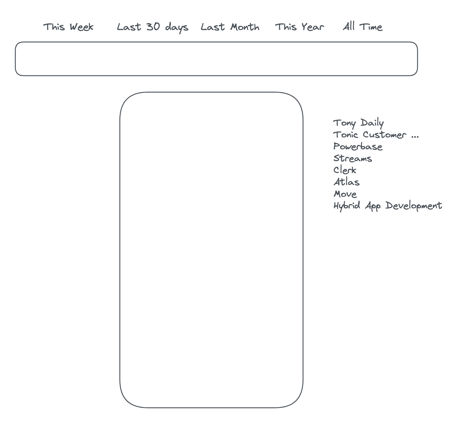
Thinking: I'm still not feeling the new top navigation from a browsability perspective - because it's horizontal it doesn't show the full names of the streams, and if it did they'd stretch out too far. I'm wondering if, now that we are fading out the content on the sides anyway, we could have a vertical streams menu to the right of the content, and potentially stretch out the time periods above the timeline at the top and make them both full width. Something like this:
-
-
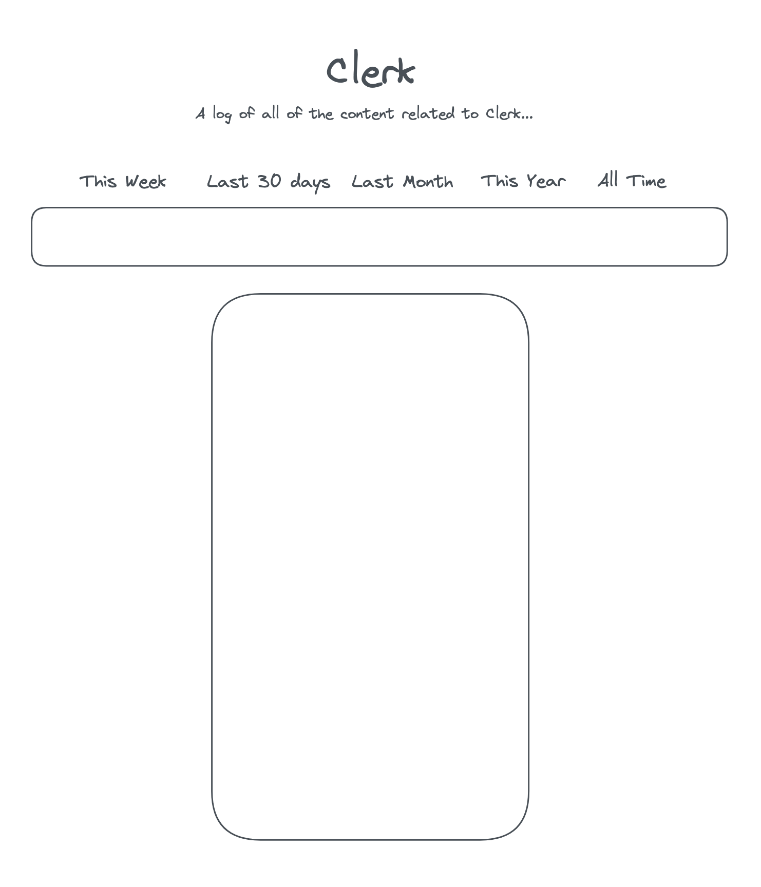
Draft up design for "Solo view" screen - a view that shows posts from a single stream with no ability to switch to other streams
-
-
Draft up the next release: March 24 release
Atlas
Mar 19
-
Sync data from prod to staging
-
Clean up git
-
Upgrade to heroku 20 and re-deploy to Heroku
-
Fix incorrect date because of caching issue on tweet cards
-
Improve styling of cards, change pill style to plain text, add background
-
Updates.fm
Mar 17
-
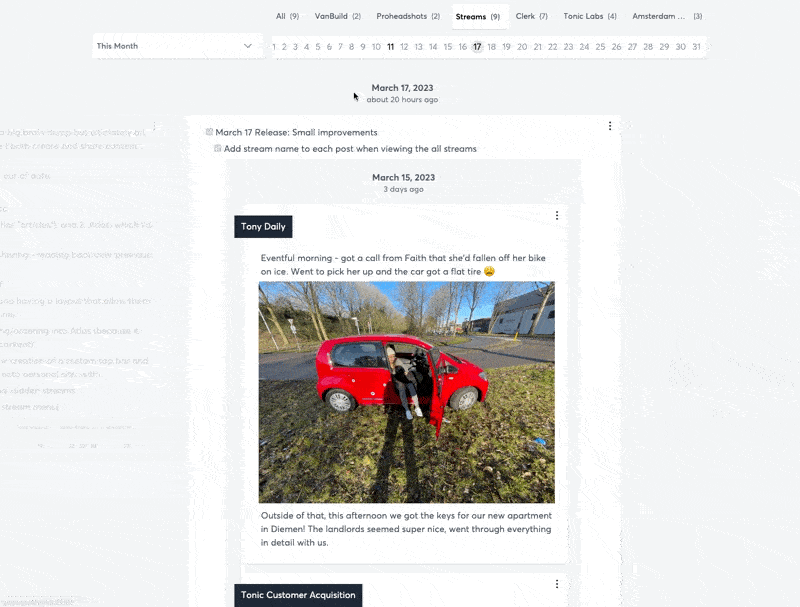
March 17 Release: Highlighter Functionality
-
Goal: Improve display of pages and the passage through time by using a highlight/opacity effect
-
-
Click a day-link on the timeline to scroll to that day
-
Reduce opacity of non-highlighted days when they're not in the center of the screen
-
Add an active class to the active day in the timeline while it's in focus, keep updated on scroll
-
Add stream name to each post when viewing the all streams
-
-
Allow modifying dates for stream posts
-
You can now add a date to a post using the
Date::attribute
-
-